Quote from 12 blueprints.com
“Heat of color can’t be judged well by eye because it’s totally relative. Saturation is hopeless to judge in a human. That leaves darkness level, so it’s over-emphasized.
Isn’t that the truth? And not just the DIYers. I believe I have mentioned a time or twenty-five thousand that I had a “professional” color analysis many years ago from which I am still recovering . Of course, back then it was much simplified. Over simplified. If one had dark hair, the choices were autumn and winter.
Since reading Zyla’s book , I have known I was a spring. (Actually, I thought I was a spring when I first read Color Me Beautiful – because of the shiny gold.) But, I admit I am having trouble assimilating the truth.
This last weekend, I spent some quality time with my own color analysis selectors and palettes. I had to conclude: Bright Tinted. Basically, spring with a hint of winter. Straight up warm, bright colors, tinted with a tiny bit of white.
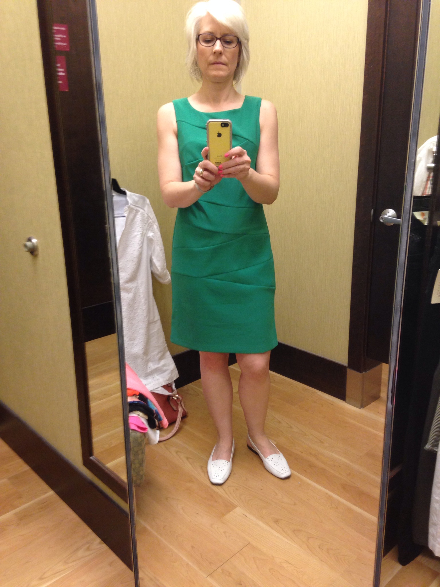
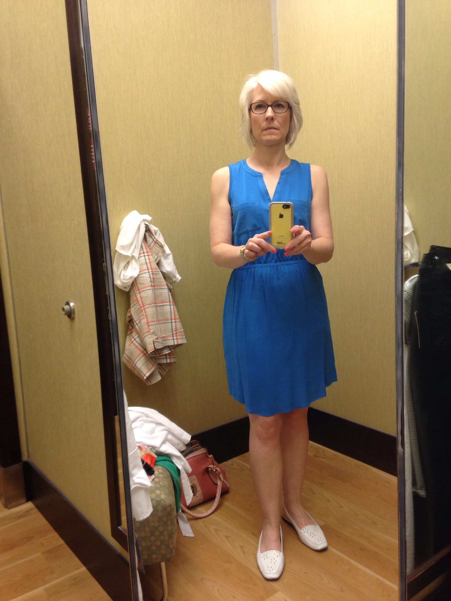
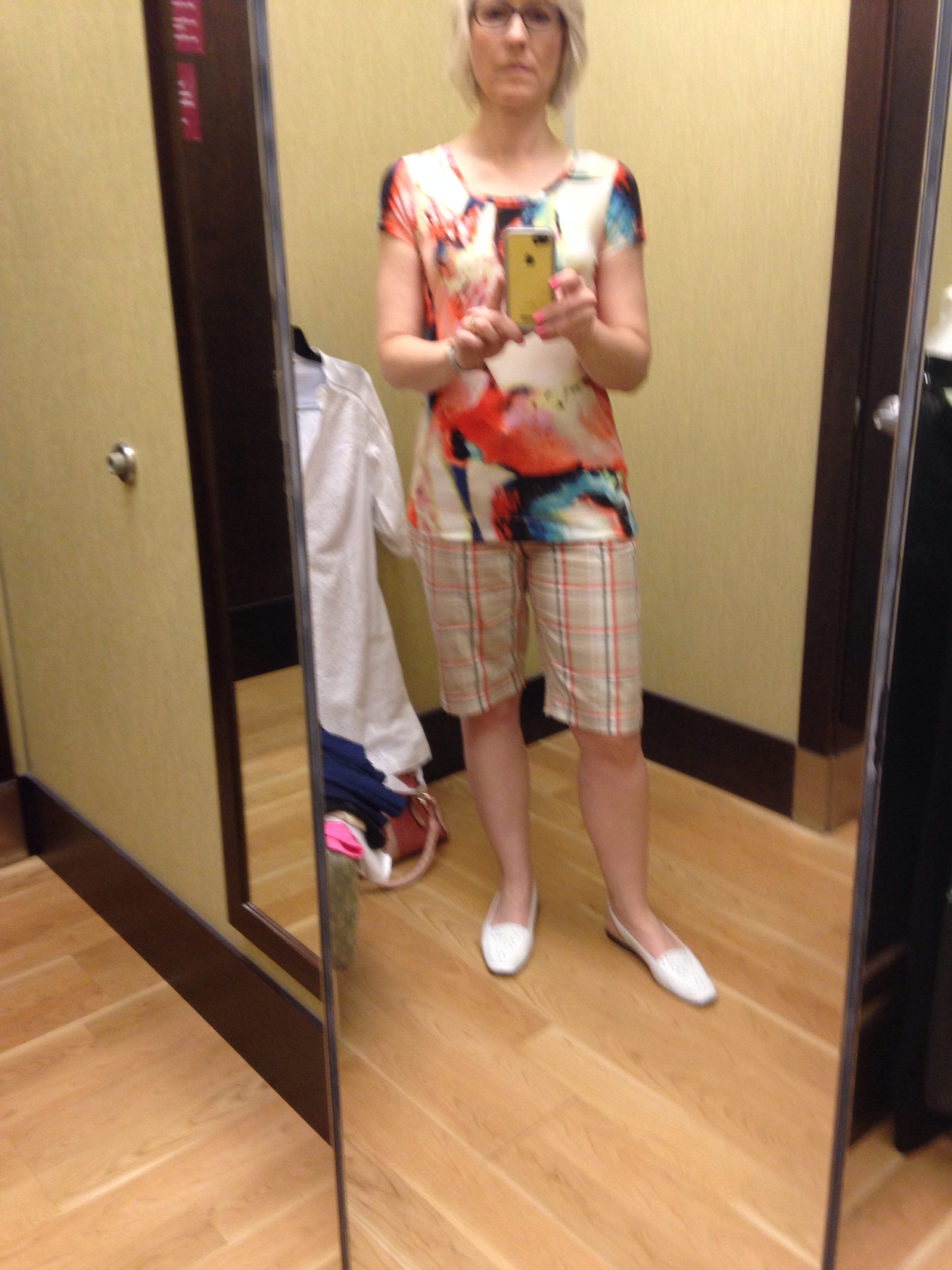
Then I went shopping at Kohl’s (40-60% off Sportswear for misses, petites and women. Select styles. 8/20-8/27). I should take my own advice more often! I got four pieces for just over $25! The colors? Coral pink, bright cyan blue, hot pink, and a multi-bright abstract print. Seeing myself in the mirror in the dressing room really drove home the reality of my colors.
Carla recommends we take photographs in the dressing room. Here are a few I took:

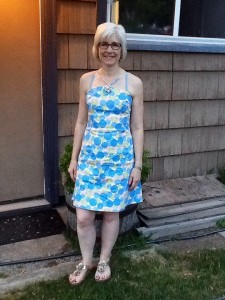
And for comparison, a photo of a cute dress I got at Value Village, NWT, for $1. These softer colors are okay, other people are very complimentary when I wear them, but it just isn’t as interesting. And I feel I should be interesting 😉


Not only are your new items very attractive on you, but your older comparison item does not seem strong enough to me, to suit what seems like your strong-mindedness, your striving after clarity of thinking. Maybe even a sense of adventurousness you might have. heh, maybe I’m reacting, too, to how the print keeps sliding off at a diagonal! I think you bring more force/focus to bear than that. 😀
I think you are right. I am so glad I went back and threw on that last photo. The more I think abut it, the less I like that dress – for the very reason you mentioned.
I have been thinking about the idea that not only the colors, but the shapes of the features appear different in different colors. Even though the lighting is different in these pictures, I think I am beginning to get an idea of what is meant by that. In the last photo, I look like a completely different person. In the bright colors, I look slimmer and smarter.
Btw, I did not buy the green dress, because of construction flaws which are not evident in the picture. I do love the color, though, so I am glad I saved the picture!
Thanks for your encouragement – it is really helpful!
Gorgeous colors in Kohls – I think you’re right.
And I have that top in your second pic. It needs to be treated gently (at least, kids laundering it has done it no favors), but has been a total workhorse for me this summer. It’s definitely my favorite printed top of the year so far.
Fun! We have the same top!
Btw, Idk if you noticed I finally replied to your comment about paint colors (https://betweenmypeers.com/2011/06/22/your-life-palette/). Better late than never!
LOVE the brights! More, more, more!