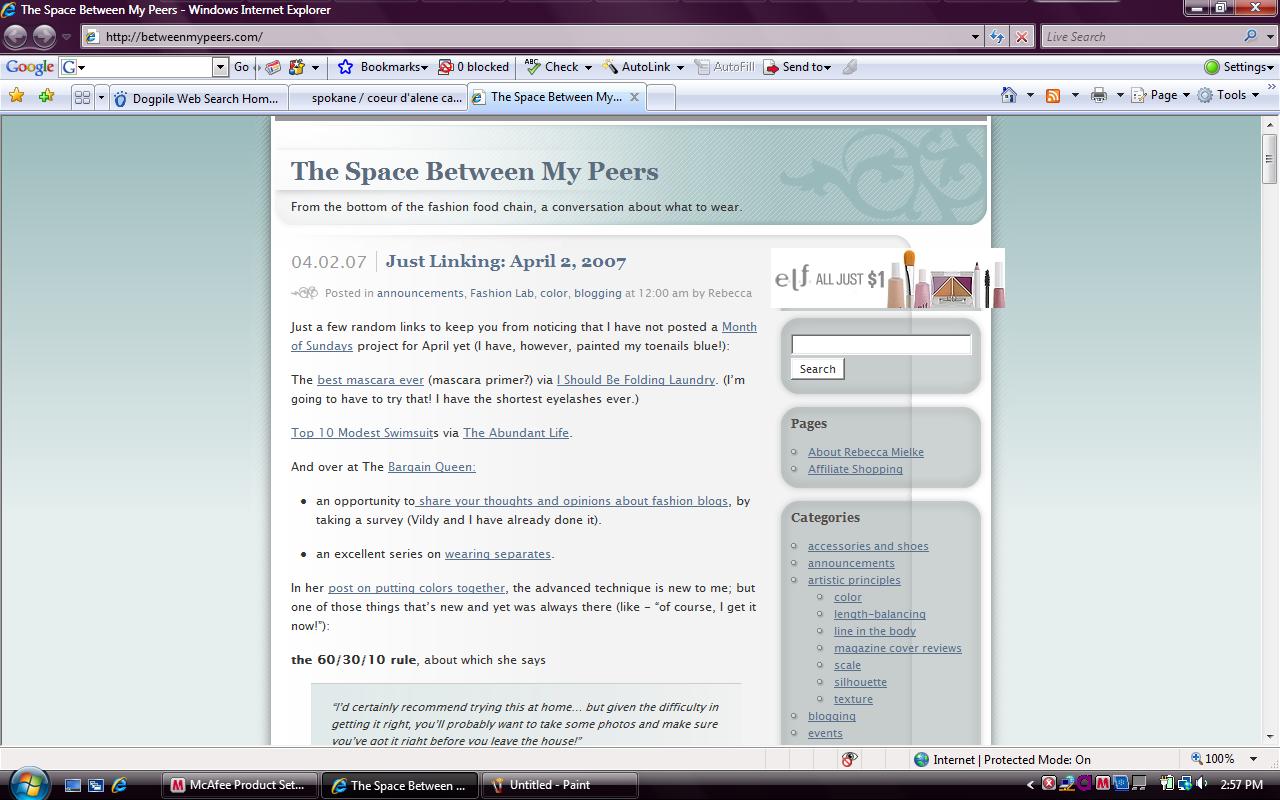
In the beginning was the basic Ocadia theme, apparently blue, although it shows green on my monitor, which I was using while battling switching-to-Wordpress learning curve.
Since Jenn declared April Amateur Improve Your Blog Month, I have:
- learned how to do a screenshot.
- adopted the new theme she found for me.
- reorganized my sidebars, just after adding some tricky things to them. It ended up taking me two weeks, which serendipitously happened to be the two weeks I was reading Don’t Make Me Think
, by Steve Krug, one of the 10 books I won from ProBlogger just before I moved from Blogger to my own domain at WordPress. It was worth it.
- So I put up the beginnings of an “about page” and moved on to Blogger’s Choice: the header picture. (My hero is still getting around to asking the volunteer photoshopper to make the changes we all came up with, especially Icy‘s suggestion to mirror the picture.)
Update: thanks Icy, for flipping the picture! When I saw my hero’s co-worker getting into another co-workers car with luggage, wearing flip-flops, I figured it might be awhile.
In conclusion, this is not the conclusion! MIntheGap has written a post about how to make my related posts section look prettier! Now’s your opportunity for input:
- Changing the bullet to a coffee cup is a no-brainer, IMHO. I just hope I can figure out all the steps.
- What do you think about having them only show up when you go to “read more”? I suggested that, now I’m having second thoughts.
- Step 3 is to put them on a background, but if I do step 2 that may not be necessary. Otherwise I was thinking just a nice pink box or something.
- Still on related posts, do you readers love or hate having them separated off by ads? It’s a little bit of extra work for me, but I’ve been trying to choose some pretty ones. 🙂
- Unrelated to related posts: I am still trying to figure out how to change the font size on the comments (in WP it must have to be changed in multiple places or something) and I think it would be fun to change the colors on the comment boxes so that my comments stood out from yours. Maybe.

1. It should be.
2. I like them on the individual posts because inline can almost be distracting.
3. We should at least use the header around “Related Posts:” to make it stand out.
4. It’s not a problem for me.
5. The comment font size is easy. Find “#commentlist li p” in your css file. After the line about margin, add “font-size:8pt;”. Change that number until you get the size you want.
Changing colors? That’ll take some php, but I can work on that one next if you like…
I think you’ve done a wonderful job on the blog remodel thus far, Rebecca!