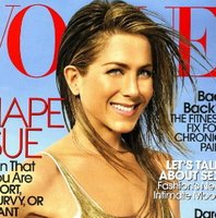
 Due to the popularity of my previous Vogue cover art critique, I thought, “better late than never”, and decided to do this one.
Ms. Jennifer Aniston is the epitome of clean, outdoorsy, natural beauty; if I may say so, the kind of beauty men understand and appreciate most.
Notice how the cover artist(s) used repetition for emphasis:
- Line shape: The arch is the predominant line present in this star’s facial features. Notice how the hair is positioned to repeat the arch of the eyebrow and emphasizes the diagonal curve of the jaw. The drape of the neckline of the dress is a similar curve.
- Surface sheen: How else to pick up and emphasize the metallic glittery quality of the golden hair but with the golden strands of –since I didn’t actually buy the magazine this time, I know not what– repeating the texture of the hair. Her skin even appears to sparkle. (Speaking of sparkle: if only I could smile naturally like that for pictures, you people might actually see my face. Alas, glare is my normal pose for the camera.)
Do try this at home:
- Line shape: Choose hairstyle, neckline and construction details to be worn near your face that repeat the lines of your facial features you wish to emphasize. Also be aware that you may be calling attention to lines you’d rather weren’t noticed. Think flippy-outy hair next to neck wrinkles. Shudder.
- Surface sheen: Think of your skin and hair in terms of shiny or matte, and wear fabrics and metals which repeat the natural reflectivity (many people are combinations). Think prom dress vs. mother-of-the-bride dress.
One other thing: if availability decreases desirability, how can wearing a sheer dress be a benefit?

I liked the “flippy-outy hair” remark.
Nice analytical post.
Thanks, Henri. You’re fun! =D