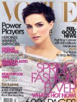
 So perfectly refreshing that it stopped me in my tracks, was that really a magazine cover without cleavage? Closer examination revealed a composition of simplicity and beauty.
What elements make this arrangement so aesthetically appealing?
Clothing selection: Natalie Portman’s pixieish crop significantly decreases the visual weight of the star’s hair. Thus, with her fair-skinned luminosity, the painted linen Prada balances her visual lightness.
Photography: Balance is not all about symmetry. Note how the neckline acts as a frame for the face.
Color: The overall beauty of the composition includes the background (matching the dress and framing the face) and the surrounding print layout (the black enhancing her hair and eyes, the pink bringing out her cheeks and lips).
Rip it off and take it home (not the magazine cover, the artistic concepts):
Visual weight: Choose clothing that harmonizes with your personal presence. Volume, texture, and depth of color all add visual weight.
Balance points: Simply stated, a neckline that is deeper than the face is long is a distraction.
Color: Try a neutral that is the same color value (dark or light), but not the same color, as your skin; accent with colors from your own personal coloring (eye, cheek, hair, or lip color).
Natalie Portman is a work of art, but so are you!

I know you’ll just die at what I’m about to say, but now that you had a good cooment about Natalie Portman, I am relieved because we actually named our daughter, Natalie, the name we did because we really liked her. Mind you, this is when she was a budding actress in Star Wars, but she seemed like a clean-cut gal at the time. =0) You know, the name actually means, “born around Christmas”, so we couldn’t really use that as a reason…is Feb 27th close to Christmas? LOL! Thanks!!! =0)